Creating a responsive navigation bar
Before starting this tutorial, let me assume that you’ve come from the CSS series on my website. So, we’ve collected some new tools to use in this tutorial:
- Knowing all CSS Selectors and where to find documents about them. Because we won’t try to remember everything. :D
- Pseudo-classes.
- Margin & padding properties.
- Media query syntax.
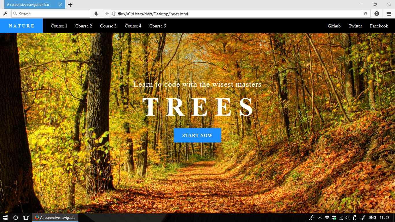
And… here is the expected result:
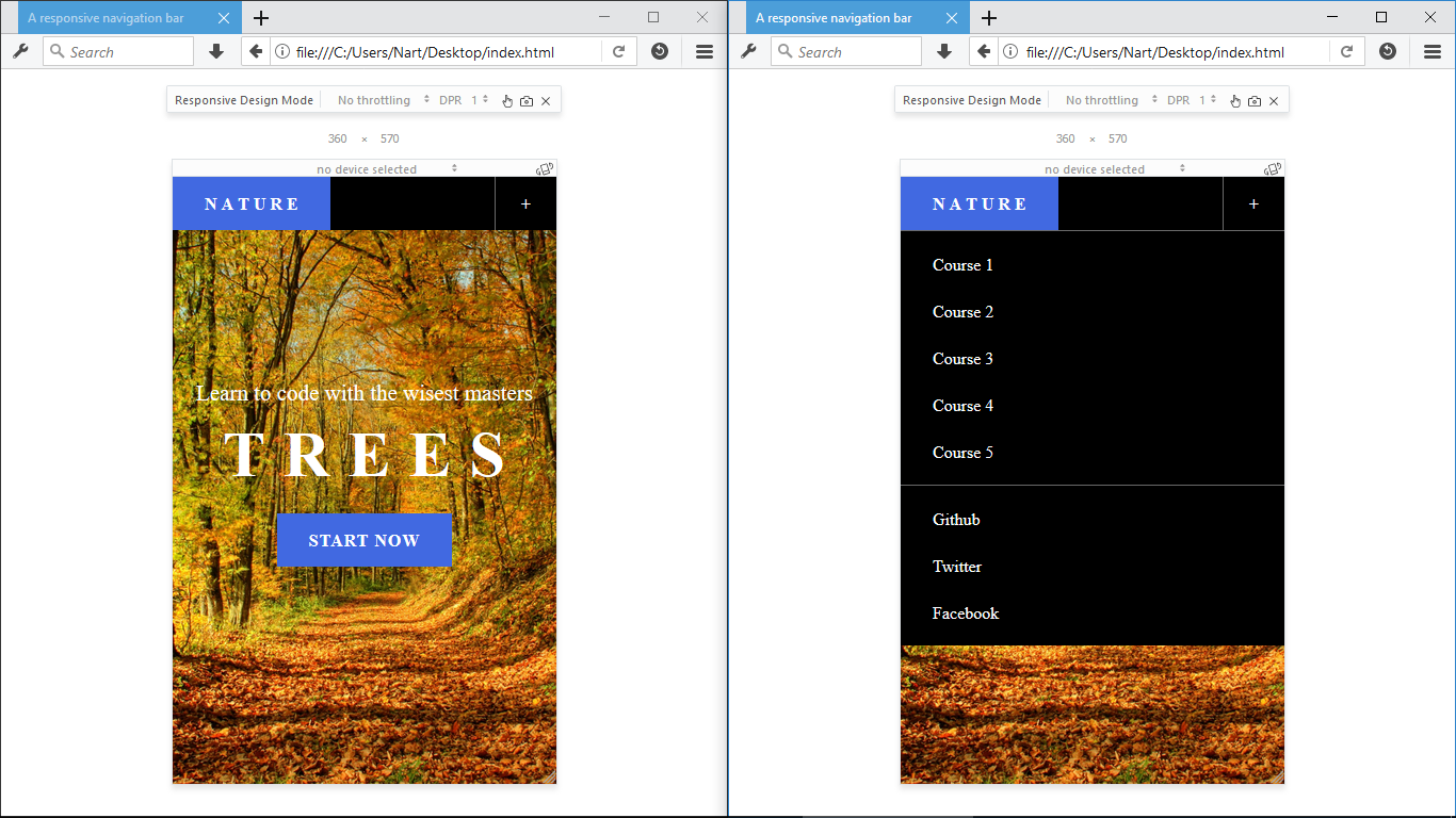
On mobile devices:
This tutorial is just an example, you should give the navigation bar your own style (size, color, font, etc…).
1. Let’s get it started
Firstly, let’s construct the navigation bar with a <nav> container and its 3
children: logo and 2 lists of links.
HTML code:
There’s something strange here, a new <meta> tag related to viewport. This
tag is used to tell web browsers that content of this website should never be
scaled smaller. And so, for all the websites which show tiny texts on mobile
devices are just missing the meta tag.
Next, let’s add some navigation links and social links. We also assume that
these links will have same styles (size, text color, hover effect, …). So,
we’re gonna group them using a nice class name: nav-link.
HTML code:
2. Styling target large screen devices
Many people on the Earth will tell you that you should write CSS code target mobile devices firstly (mobile first design). But, there’s no fixed rule. In this tutorial, we’re gonna write CSS target large screen devices before taking care of mobile devices.
This task can be divided in sub-tasks:
- Laying out 2 lists of links to make them stay in a same row, and pulling one to the right.
- Coloring stuff, and sizing up all the links.
- Adding hover-effect to all the links (excluded the logo).
2.1 Laying out link-lists
By default, the two link-list wrapped using <div> tag will have the property
display: block and does not allow them to stay in a row with the logo .navbar-brand.
Let’s fix this.
CSS code:
To pull the .navbar-right to the right, the simple solution is using
position: absolute and set position of the list base on its parent .navbar.
You can also consider to pin the navigation bar on top of the viewport by using
position: fixed; Or if not, just make it position: relative so we can set
position of the .navbar-right.
CSS code:
2.2 Coloring & Sizing
Colors first, as they help our eyes to notice elements’ sizes. We’re gonna remove links’ underlines as well.
CSS code:
To size up all the links, we’ll use padding instead of width & height properties.
This makes their sizes flexible; So, we don’t have to care about if the inner
texts are long or short.
CSS code:
2.3 Adding hover-effect
I love subtle effects and am using the one which is used by Github’s website. When user hovers mouse over a link, text color will just dim a little bit. Just exclude the logo.
CSS code:
3. Styling target mobile devices
Now, it’s time to use media query syntax. I’ll just create only 1 break point at
842px. You can create more break points if you feel that it’s needed.
CSS code:
Before discussing what we need to do, let’s resize your web browser to see how the navigation bar will look like on mobile devices.
Screenshot:
Todos:
- Make the two lists of links displayed vertical
- Make the navigation bar toggleable (collapse/expand)
- Add a toggler-button to the right corner or the navigation bar
3.1 Make the two link-lists vertical
In the previous sections, we’ve make the two lists of links and all anchor elements
inline-block; And we also set position of the second list to the right using
position: absolute. Just override these two properties.
CSS code:
3.2 Make the navigation bar toggleable
Normally, this task will be handled by using another language called JavaScript.
As we’ve not met JS yet, then we’ll make it the CSS way by using a
checkbox
as an indicator; And we’ll use the pseudo-class :checked to change size of the
navigation bar base on the indicator’s state.
HTML code:
CSS code:
That’s it. If the checkbox is checked, it means the navigation bar is collapsed. Now we can toggle the navigation bar by checking/unchecking the checkbox.
3.3 Add a toggler-button to the right
We all know that checkbox is not friendly to mobile users. It’s hard to tap such a tiny box. The solution is to hide the checkbox and use a label element as a button to toggle the checkbox.
We also want to make the checkbox and the button hidden to large screen devices. So, remember to move a piece of code to outside of the media query block.
HTML code:
CSS code:
4. Cleaning up code
Congrazz!!! You’ve created a responsive navigation bar! You’re awesome. :D
You may also want to add some borders to separate components like the toggler-button and the two lists of links before cleaning up your code and merge classes’ styles.
CSS code:
Here are the links to full source code of this tutorial (included some minor enhancements):
5. Conclusion
It takes ~100 lines of CSS code to create the navigation bar. You’ve done a serious work. But we can even make it better in future:
- The navigation bar is lack of animation/transition when it’s toggled.
- It’s also lack of icons set as we’ve use text to describe social links. Oh, not really. Maybe you love words over icons as I do.
Ready to learn more and create better? :D
Let’s go back to our unfinished CSS tutorial. There’re many interesting stuff
waiting for us.
Click here to go back to the CSS tutorial about Media Query.