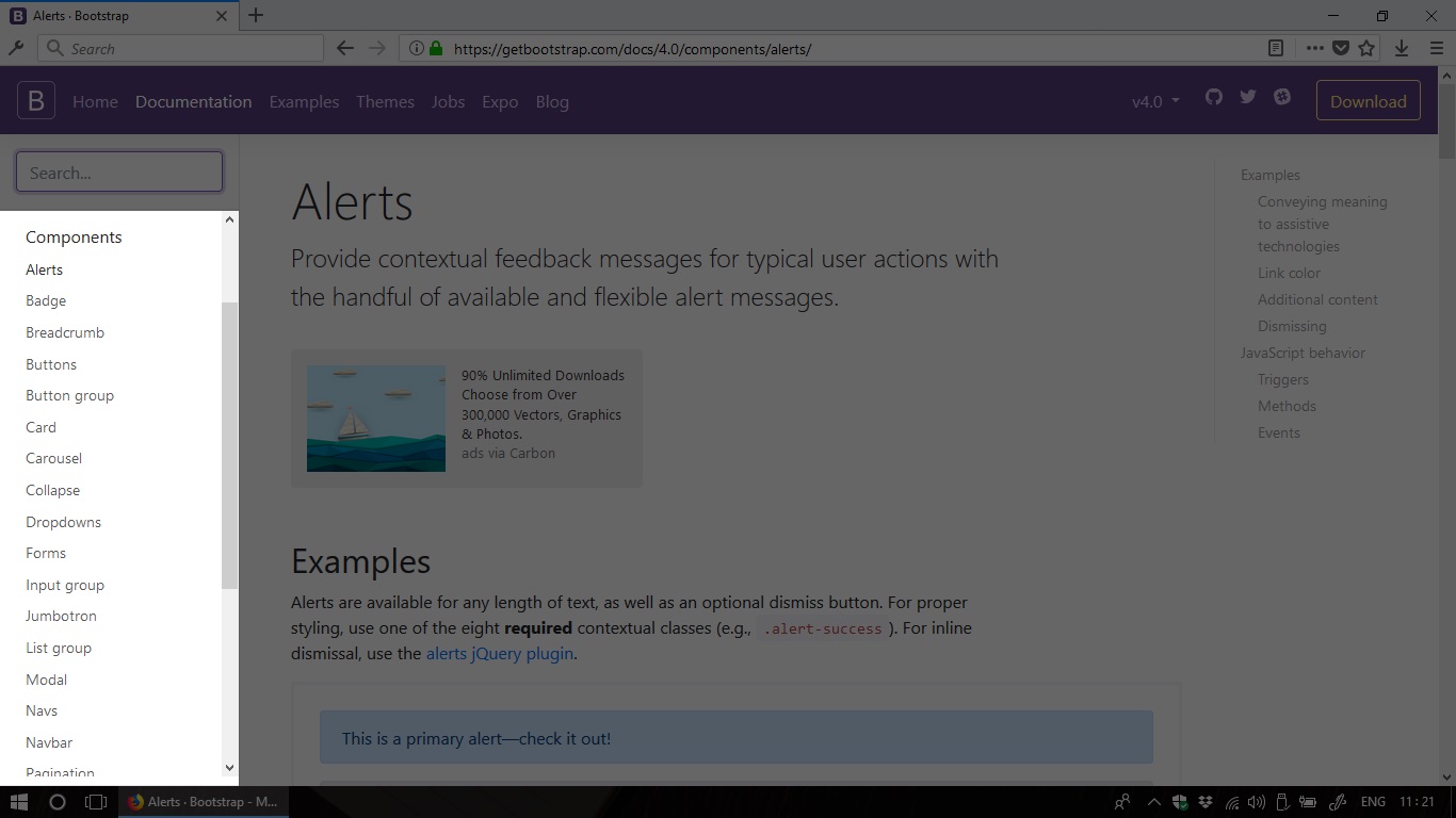
Bootstrap's components
The current version of Bootstrap (v4) comes with 21 pre-built components which
are ready-to-use and very composable. We can find the list of all components on
the left sidebar of Bootstrap’s official website:
getbootstrap.com -> Documentation -> Components
Screenshot:
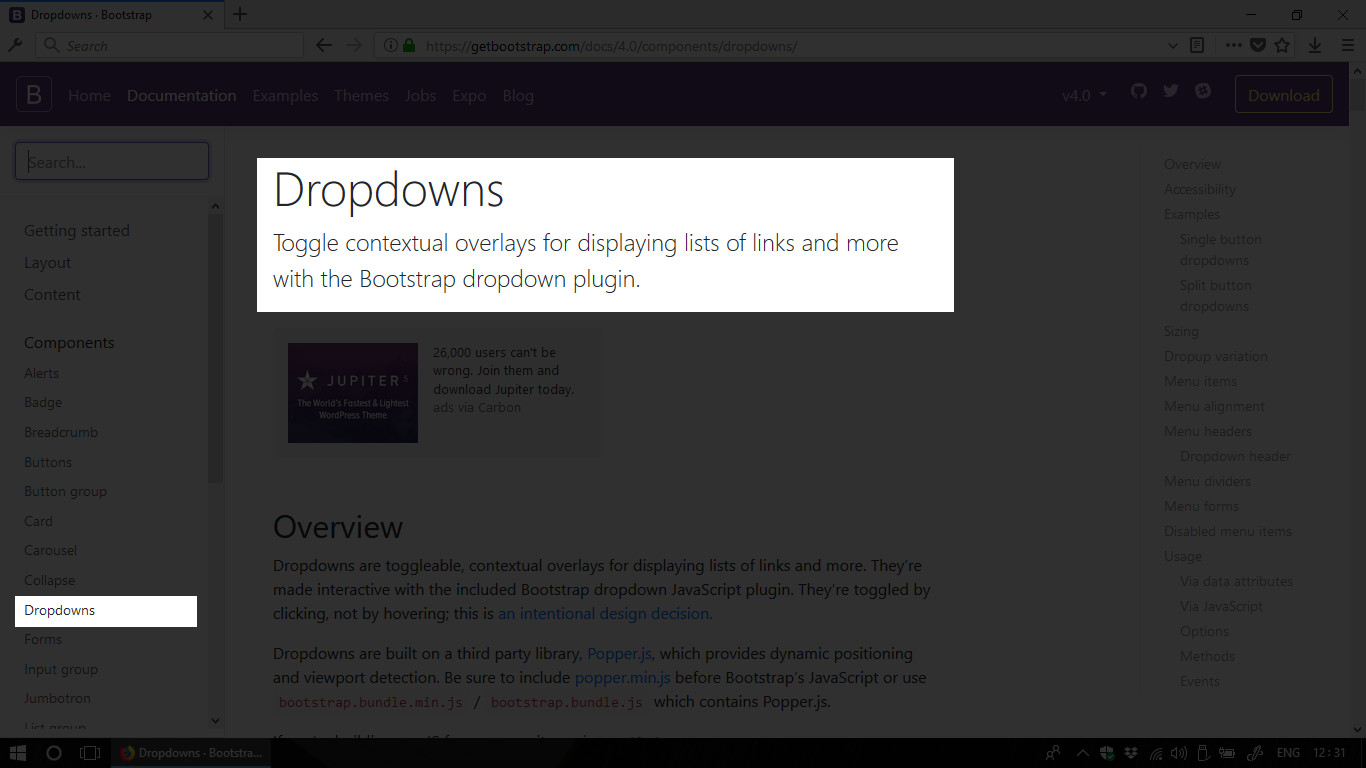
For each component, there is a long-read document which contains sample codes and
more information for customization. Let’s peek in the dropdowns document:
Components -> Dropdowns
Screenshot:
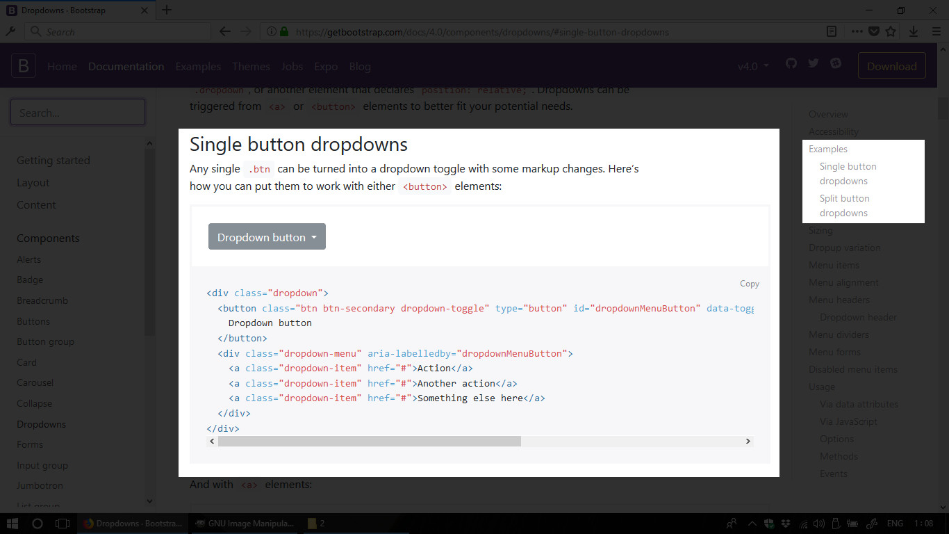
You can use the document’s index on the right sidebar to navigate to the Examples
section. Just copy the sample code and try it on your own sample webpage.
Screenshot:
HTML code:
Result:
See the Pen Todos by Kei Nart (@codenart) on CodePen.
Can we call that a magic? We’ve done nothing but copy/paste and the dropdown appear on our webpage. Yet, its design looks nice and it just works like a charm. :D
Customizing components
Some Bootstrap’s components are delivered with various pre-defined styles. For
example, we can quickly switch color of the button in the previous example by
changing the class btn-secondary to btn-danger. We can also change size of
the button by adding the class btn-sm or btn-lg.
You can checkout some more button’s options in the following document:
Components -> Buttons#examples
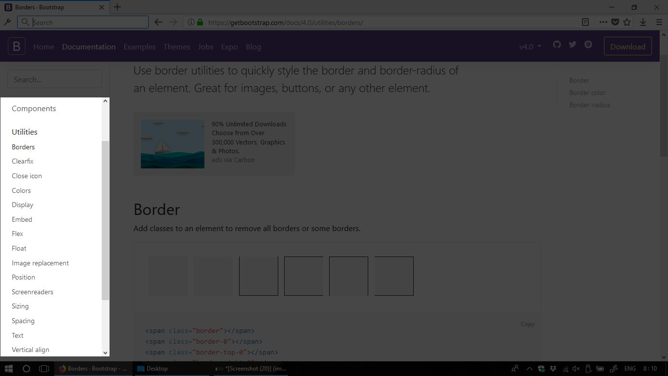
For the components which do not have various pre-defined styles, Bootstrap provides
other toolsets for customization. They are called utilities or helper classes.
You can find the utilities menu below the components menu on the left sidebar.
getbootstrap.com -> Documentation -> Utilities
Screenshot:
As you noticed, there’re not only color utilities but also many other toolsets
like position, sizing, spacing, etc…. If you try out all these things and
build some webpages, you will realize that you only have to write very little CSS
code to build a nice website.
In case the pre-defined styles do not match your design, let’s say your favorite
blue background is brighter than Bootstrap’s bg-primary, you can override the
class by using the override.css file.
Bootstrap’s default breakpoints
Since Bootstrap’s components are responsive-ready, it’s important to know about Bootstrap’s default breakpoints. A breakpoint is the point that a component may change its look to well adapted to user’s screen. And the following are the default breakpoints of Bootstrap:
CSS code:
With those breakpoints, many Bootstrap’s components come with responsive optional classes which allow us to choose the right breakpoint to fit our design purpose.
For example, the Bootstrap’s
Navbar use a class
navbar-expand{-sm|-md|-lg|-xl} for responsive collapsing. If we use the
smallest breakpoint, let’s say navbar-expand-lg, the navbar will apply mobile
design to devices which has screen size smaller than 992px, and the larger
screen size will experience desktop design.
Notice that the class name pattern is also applied for other toolsets: Utilities,
Layout (we’ll talk about layout toolset in the next tutorial). So let’s take
note of those breakpoints once again:
-xl-stands for extra large device which are equal or greater than1200px-lg-large device … equal or greater than992px-md-medium device … equal or greater than768px-sm-small device … equal or greater than576px- No breakpoint keyword … smaller than
576pxorany
The most effective way to learn anything is always doing, applying, testing. So, I recommend you to copy/paste some Bootstrap’s components and utilities from their documents to play around with them. It’s important to experience their magic before heading to our next tutorial. See you then!