Bootstrap's utilities for content
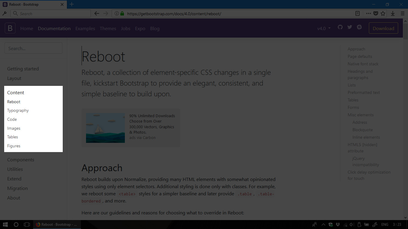
Just peek in the Content menu on the left sidebar of the Bootstrap’s official website:
getbootstrap.com -> Documentation -> Content
Screenshot:
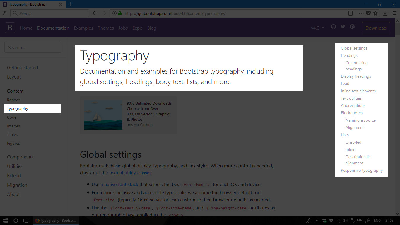
Wew, there are only a few things appeared in the sub-menu. Since the most common
content types in almost every websites are text and image, Bootstrap’s
Content toolsets are all about those 2 content types. The most frequently used
toolset is the one related to Typography. Let’s see what we have in this toolset.
Screenshot:
The section Headings talks about common styles of heading tags pre-defined by
Bootstrap. They also provide heading classes which can make any text element
look like a heading.
Next section Display headings contains some classes which are pre-defined with
a display font. If you’re not familiar with design stuff, then a display font is
a strong typeface which will strongly attract user’s eyes. Normally, these
utilities will be applied for contents sit on front-pages.
Let’s write a piece of code to see the difference between heading classes
and display heading classes. We’ll also use the class lead which makes a
paragraph stand out.
HTML code:
Result:
See the Pen Bootstrap's Typography by Kei Nart (@codenart) on CodePen.
Please check the Text-Utilities section and Blockquote section if you have some time. We’ll need to use them when build the sample homepage mentioned in the first tutorial.
Laying out using Bootstrap’s grid system
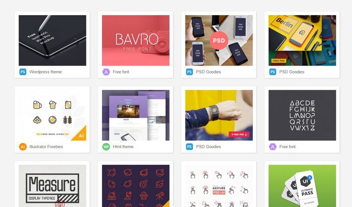
To simplify laying out task, Bootstrap uses grid system. The idea is simple. Every container can be divided into 12 columns which has the same width. Each of the container’s children will take some columns (up to 12) to adapt the design purpose. Let’s say when we want to create a product grid with many cards like the image below. Each card will take 3 columns and we will have 4 cards per row. Let’s see how Bootstrap’s Grid can help in this case.
Sample image:
HTML code:
Result: Click here to see the result
Simple? :D
Yet, Bootstrap’s Grid can also help us to create a responsive layout. We can let
PC users see 4 products per row; tablet users will see 2 products per row; and
smartphone users will see only one product per row. Let’s change our code snippet
a little bit and resize your web browser window to see the result.
HTML code:
Result: Click here to see the result
And this is how the grid works in the example above. For smartphone devices which
has screen size smaller than -sm- breakpoint, both of the two classes col-sm-6
and col-lg-3 will give width: 100%. So, we’ll have only 1 product per row;
For tablet devices, the class col-sm-6 will give max-width: 50% which means 6
columns in based 12-columns grid. So, we’ll have 2 products per row.
For large screen devices, the class col-md-3 will give max-width: 25%. So,
we’ll have 4 products per row.
The current version of Bootstrap (v4) provides a new feature that allow us to align items using a helper class. Please check the Alignment section before heading to our next tutorial. We’ll build a simple homepage as planned in the beginning of this series. :D