How to Bootstrap a website?
If you’ve been following my blog from the CSS tutorial about
Frameworks & Icons
then you already knew what Bootstrap is. But, I still want to re-introduce the
thing in case someone just accidently comes here and joins our tutorial.
Bootstrap is the most popular HTML/CSS frameworks which provides common components (navigation bar, dropdown, image slider, grid layout tools, …) to help us build websites easier, faster, and smarter. :D
To start using Bootstrap, we need to use the following template to initialize every HTML documents.
HTML code:
As you noticed that, we have embedded a CSS file named bootstrap.min.css from
somewhere on the internet. This CSS file contains pre-written styles for
common components.
There’s also a blank CSS file named override.css which is embedded right after
the Bootstrap’s CSS file. This CSS file can be used to write some rules to override
styles of used components. The purpose is to make our webpages look unique. :D
At the end of the <body> section, there are 3 JavaScript files which contain
pre-written codes that make some interactive components work out of the box.
So, you don’t have to learn JavaScript to start using Bootstrap.
Where to find Bootstrap components?
From Bootstrap’s official homepage! - http://www.getbootstrap.com/
Sure. I’ve said that I’m not going to create another Bootstrap document on my
blog. My purpose is to share with you the most simple way to use Bootstrap and
apply it to create a webpage. So, throughout my Bootstrap series, we’ll explore
the Bootstrap’s official document and create a simple homepage together.
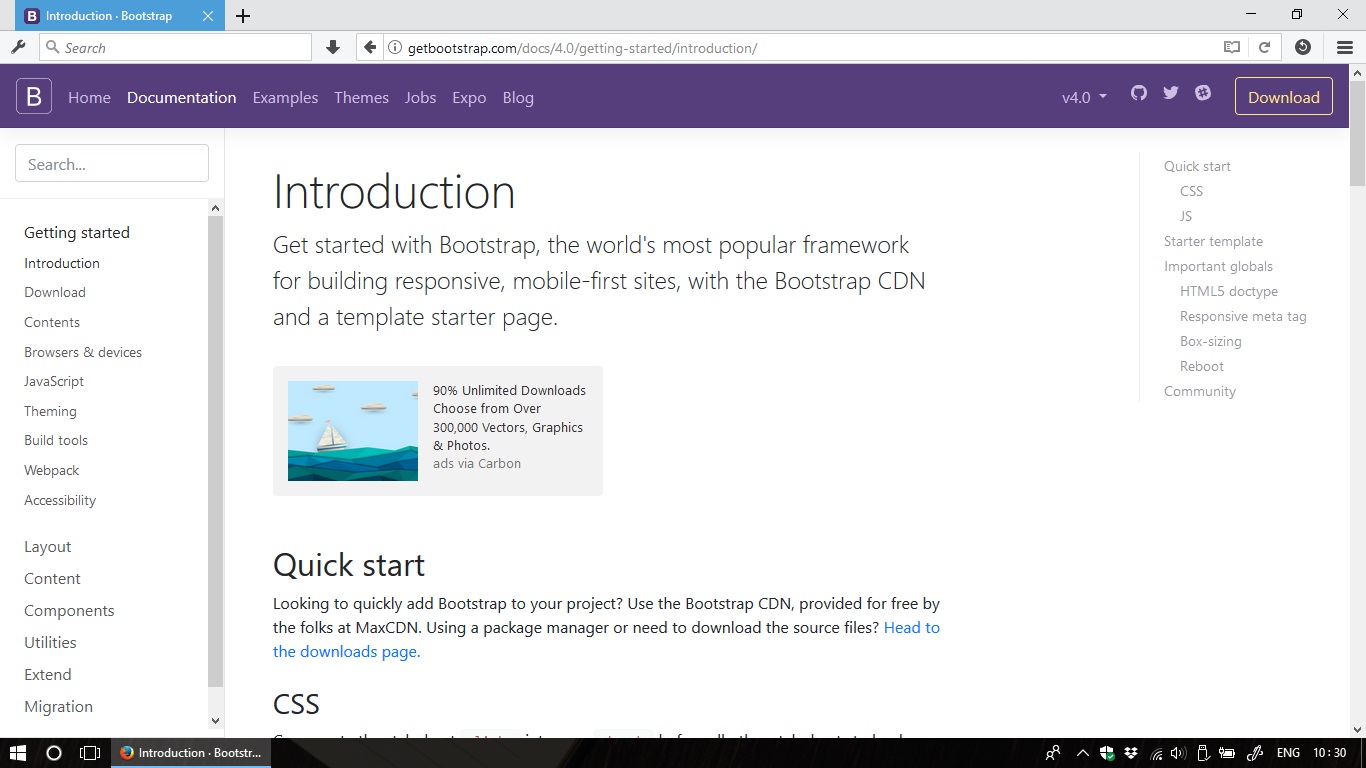
Let’s peek in the document: Click here to see Bootstrap’s official document.
Screenshot:

On the left bar of the website, there are 4 important menus which we’ll frequently use:
- Components | This part contains all the pre-built components which are ready to used.
- Utilities | Many
utility classes which help us to quickly enhance any components without writing
much CSS code in our
override.cssfile. - Layout | Some layout classes which help us to create responsive grid. Let’s say if we want to create an e-commerce site with a product list which will display as 4 columns on laptops and 1 column on mobile devices, this task can be done very easily with the layout classes.
- Content | This part contains helper classes related to typography and common content types.
For each of the menus above, we’ll make a single tutorial and talk about the most important stuff. Later, we’ll create a simple homepage together and I’ll also list some resources for practicing. Here is the simple homepage which we’ll create in the end of the series:
Simple homepage - Bootstrap it !
Are you ready to play with Bootstrap? See you in the next tutorial! :D